In this section, we will learn what the flex align-content property is and how to use it in CSS.
Click here to run the example of flex align-content proeprty.
Note: if you run the sample above in a Firefox browser and activate the "Flexbox Inspector tool" you'll get a better perspective on how this property treats flex-lines. (Check "flexbox" section if you don't know what the "Flexbox Inspector" is and how it works)CSS flex align-content Property Definition and Usage
By default, the flex-lines sit next to each other from the start point of Cross-Axis toward the end of Cross-Axis and if the container had available space, that space will appear at the end of the Cross-Axis.
Of course this is the default behavior and CSS provided a property named align-content by which we can position flex-lines differently along the Cross-Axis of the container and so as a result, the available space along this axis (if any) will be spread differently than just appearing at the end point of the Cross-Axis.
Note: the flex-wrap property should be set to any value other than “nowrap” and there should be multiple rows along the Cross Axis in order to see the effect of this property.
CSS flex align-content Property Syntax
align-content: stretch|center|flex-start|flex-end|space-between|space-around|initial|inherit;CSS flex align-content Property Value
The values that can be set for this property are:
-
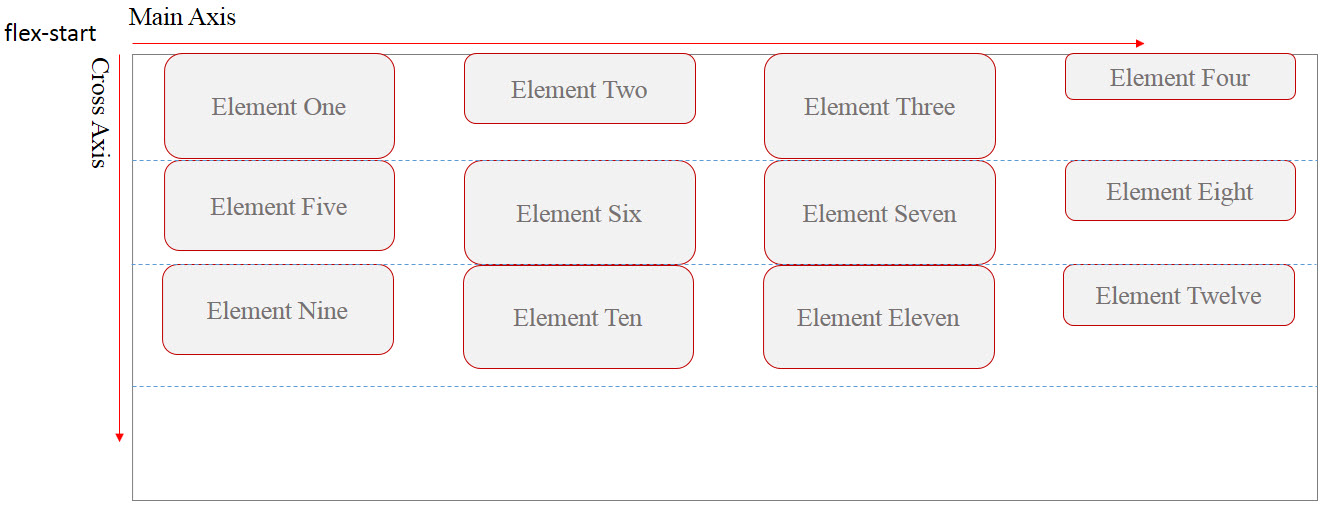
flex-start: this is the default value and it
makes the flex-lines to sit next to each other from the start point of
the Cross-Axis toward the end of it. The remained space of the container
will appear at the end of Cross-Axis. (unless there’s a margin for each
flex-items, you won’t see any space between them)

-
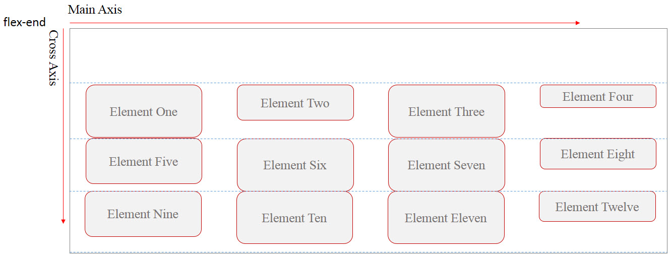
flex-end: this value is the opposite of
“flex-start” value.

-
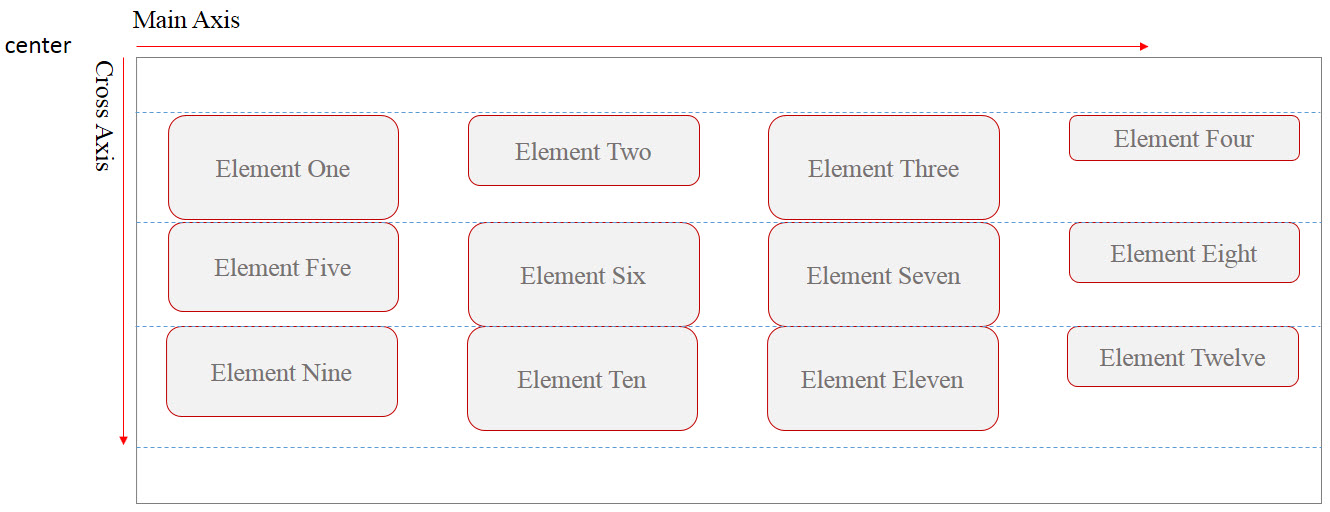
center: using this value, the flex-lines will be
placed at the center of the container along the Cross-Axis and any
remained space of the container will appear evenly around the last and
the first flex-lines. (unless there’s a margin for each flex-items, you
won’t see any space between them)

-
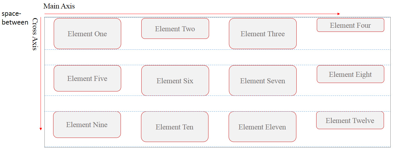
space-between: Using this value, the first
flex-line will be positioned at the start point of the Cross-Axis and
the last flex-line will be positioned at the end of the Cross-Axis. The
remained space of the container will appear evenly between the rests of
flex-lines.

-
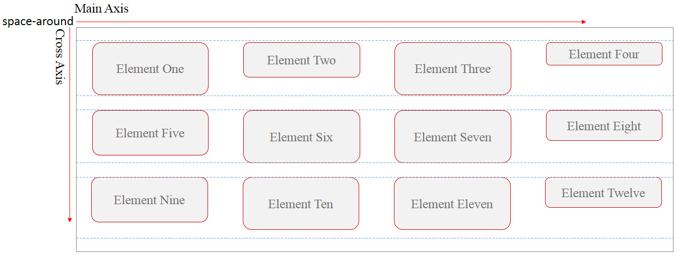
space-around: this value is similar to
“space-between” but using this value also adds even space before and
after the first and the last flex-lines.

-
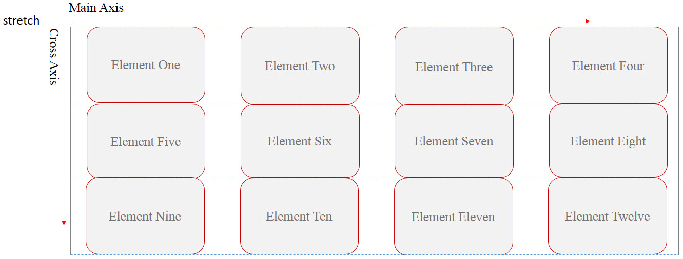
stretch: this is the default value and if used,
all lines (rows) will stretch along the Cross-Axis to fill the remained
space.

Example: align center with CSS
<!DOCTYPE html>
<html>
<head>
<title>CSS is fun :)</title>
<meta name="viewport" content="width=device-width, initial-scale=1.0">
<style type="text/css">
*, ::after, ::before{
margin:unset;
box-sizing: border-box;
}
.flex{
display: flex;
width:100vw;
height:20em;
flex-wrap: wrap;
align-content: center;
border:thin solid red;
}
.item{
min-width: 50vw;
flex:0 1 auto;
}
.item:nth-child(odd){
background-color: orange;
}
.item:nth-child(even){
background-color: lightskyblue;
}
</style>
</head>
<body>
<h1>Center</h1>
<div class = "flex">
<div class = "item item1">Item One</div>
<div class = "item item2">Item Two </div>
<div class = "item item3">Item Three</div>
<div class = "item item4">Item Four</div>
<div class = "item item5">Item Five</div>
</div>
</body>
</html>
Example: CSS flex align-content flex-end
<!DOCTYPE html>
<html>
<head>
<title>CSS is fun :)</title>
<meta name="viewport" content="width=device-width, initial-scale=1.0">
<style type="text/css">
*, ::after, ::before{
margin:unset;
box-sizing: border-box;
}
.flex{
display: flex;
width:100vw;
height:20em;
flex-wrap: wrap;
align-content: flex-end;
border:thin solid red;
}
.item{
min-width: 50vw;
flex:0 1 auto;
}
.item:nth-child(odd){
background-color: orange;
}
.item:nth-child(even){
background-color: lightskyblue;
}
</style>
</head>
<body>
<h1>Center</h1>
<div class = "flex">
<div class = "item item1">Item One</div>
<div class = "item item2">Item Two </div>
<div class = "item item3">Item Three</div>
<div class = "item item4">Item Four</div>
<div class = "item item5">Item Five</div>
</div>
</body>
</html>
Example: CSS flex align-content property space-around
<!DOCTYPE html>
<html>
<head>
<title>CSS is fun :)</title>
<meta name="viewport" content="width=device-width, initial-scale=1.0">
<style type="text/css">
*, ::after, ::before{
margin:unset;
box-sizing: border-box;
}
.flex{
display: flex;
width:100vw;
height:20em;
flex-wrap: wrap;
align-content: space-around;
border:thin solid red;
}
.item{
min-width: 50vw;
flex:0 1 auto;
}
.item:nth-child(odd){
background-color: orange;
}
.item:nth-child(even){
background-color: lightskyblue;
}
</style>
</head>
<body>
<h1>Center</h1>
<div class = "flex">
<div class = "item item1">Item One</div>
<div class = "item item2">Item Two </div>
<div class = "item item3">Item Three</div>
<div class = "item item4">Item Four</div>
<div class = "item item5">Item Five</div>
</div>
</body>
</html>