In this section, we will learn what the grid align-content property is and how to use it in CSS.
Click here to run the example of grid align-content property.
CSS grid align-content Property Definition and Usage
The grid that we build using CSS resides within an element that is technically the container of that grid.
If the size of the grid-container was vertically bigger than the grid itself, we can decide how we want the grid to be vertically positioned inside the grid-container using the CSS align-content.
CSS grid align-content Property Syntax
align-content: value;CSS grid align-content Property Value
Here’s the list of values we can set for this property:
-
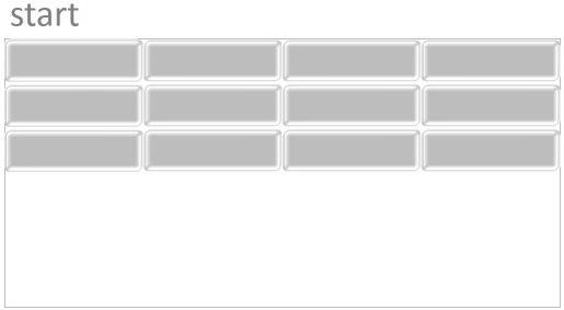
start: Using this value, the grid will be
positioned at the top edge of the container and push any free space to
the bottom edge of the container.
-
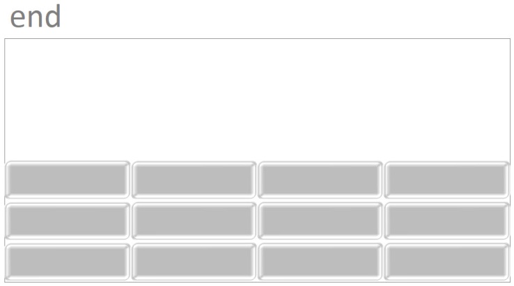
end: Using this value, the grid will be
positioned at the bottom edge of the container and push any free space
to the top edge of the container.

-
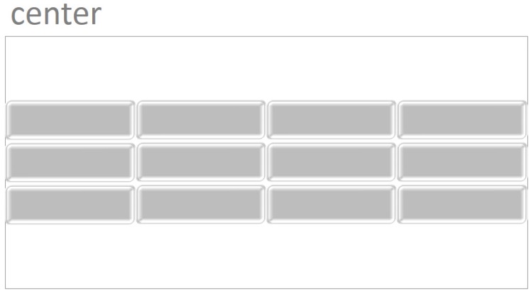
center: using this value, the grid will be
positioned at the center of the container and push any free space around
them (but not between them).

-
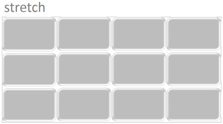
stretch: Using this value, the grid will stretch
its rows in order to fill any vertical free space of the
container.

-
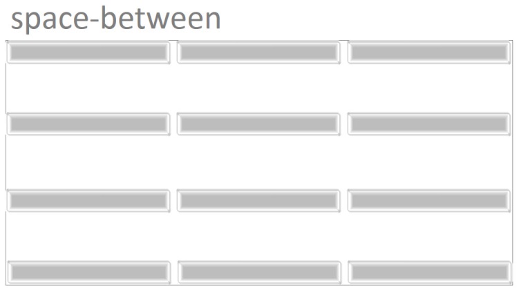
space-between: Using this value, the first and
last column (horizontal track) of the grid will be positioned at the top
and bottom edge of the container and any free space will be pushed
between the rest of rows.

-
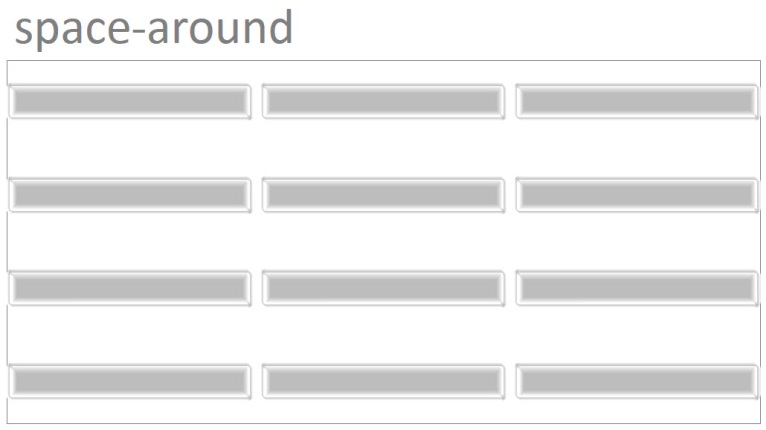
space-around: Using this value, any vertical
free space of the container will be evenly pushed around columns
(horizontal tracks) except that first and the last columns will take
half of the space that is pushed between each column.

-
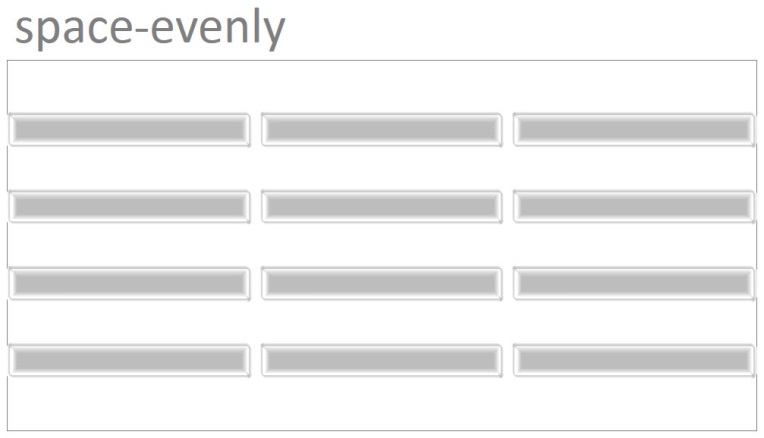
space-evenly: Using this value, any vertical
free space of the container will be evenly pushed around columns
(horizontal tracks).

Example: align center with CSS
<!DOCTYPE html>
<html>
<head>
<title>CSS is fun :)</title>
<meta name="viewport" content="width=device-width, initial-scale=1.0">
<style type="text/css">
*, ::after, ::before{
margin:unset;
box-sizing: border-box;
}
.grid{
display: grid;
grid-template-rows: repeat(2 , minmax(100px , auto));
grid-template-columns: repeat(3, 20vw);
grid-gap: 2px;
align-content:center;
height:90vh;
border:thin solid;
}
.item{
background-color: whitesmoke;
border:thin solid;
}
</style>
</head>
<body>
<div class = "grid">
<div class = "item item1">Item One</div>
<div class = "item item2">Item Two</div>
<div class = "item item3">Item Three</div>
<div class = "item item4">Item Four</div>
<div class = "item item5">Item Five </div>
</div>
</body>
</html>
Example: grid align-content end
<!DOCTYPE html>
<html>
<head>
<title>CSS is fun :)</title>
<meta name="viewport" content="width=device-width, initial-scale=1.0">
<style type="text/css">
*, ::after, ::before{
margin:unset;
box-sizing: border-box;
}
.grid{
display: grid;
grid-template-rows: repeat(2 , minmax(100px , auto));
grid-template-columns: repeat(3, 20vw);
grid-gap: 2px;
align-content:end;
height:90vh;
border:thin solid;
}
.item{
background-color: whitesmoke;
border:thin solid;
}
</style>
</head>
<body>
<div class = "grid">
<div class = "item item1">Item One</div>
<div class = "item item2">Item Two</div>
<div class = "item item3">Item Three</div>
<div class = "item item4">Item Four</div>
<div class = "item item5">Item Five </div>
</div>
</body>
</html>