In this section, we will learn what the align-self property is and how to use it in CSS.
Click here to run the first example.
Click here to run the second example.
CSS align-self Property Definition and Usage
By default, if the height of a flex-item wasn’t explicitly set, it will stretch along Cross-Axis of the Flex-container and fills the entire space of its flex-line.
But CSS provided a property named align-self by which we can control the positioning of individual flex-items along the Cross-Axis, as well.
CSS align-self Property Syntax
align-self: auto|stretch|center|flex-start|flex-end|baseline|initial|inherit;CSS align-self Property Value
The values we can set for align-self property are:


-
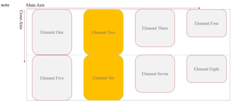
auto: this is the default value and it will
follow the value set for `align-items` property. -
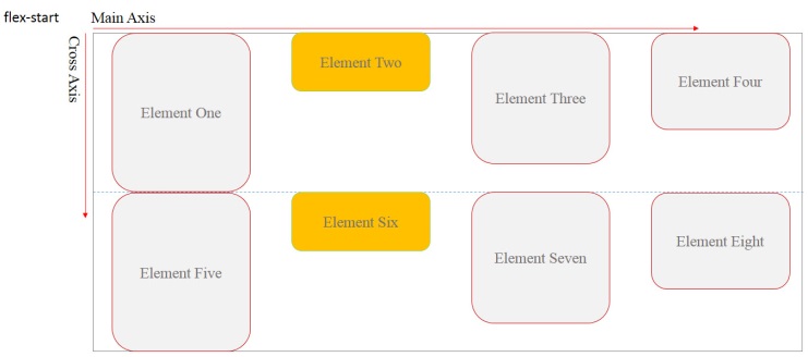
flex-start: using this value the target
flex-item will be positioned as close as its flex-line allows to the
start-point of the container’s Cross Axis. -
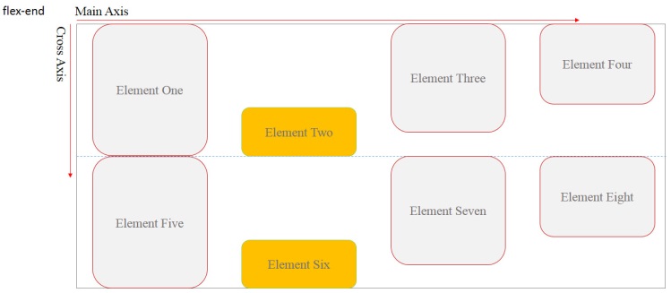
flex-end: using this value the target flex-item
will be positioned as close as its flex-line allows to the end-point of
the container’s Cross Axis. -
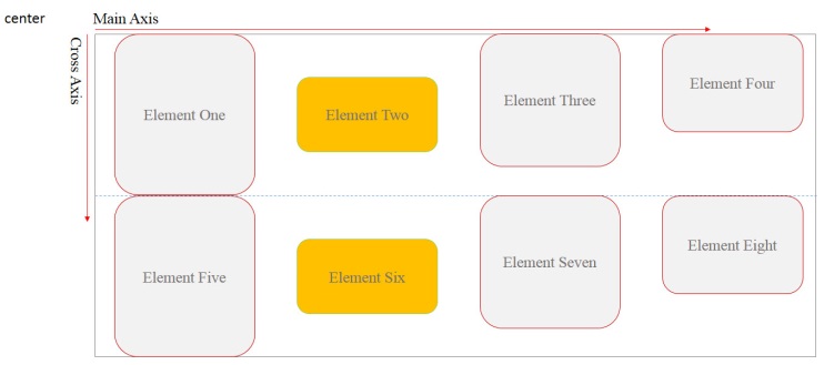
center: using this value the target flex-item
will be positioned on the center of its flex-line. -
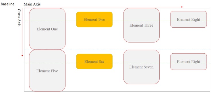
baseline: using this value the target flex-item
will be positioned in a way that its baseline aligns with other
participant flex-items within related flex-line. -
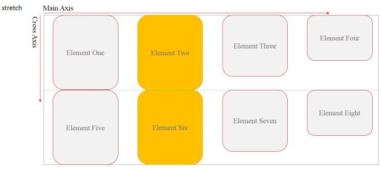
stretch: using this value, it makes the target
flex-item to stretch along Cross-Axis of the container.
Example: flexbox align self
<!DOCTYPE html>
<html>
<head>
<title>CSS is fun :)</title>
<meta name="viewport" content="width=device-width, initial-scale=1.0">
<style type="text/css">
*, ::after, ::before{
margin:unset;
box-sizing: border-box;
}
.flex{
display: flex;
width:100vw;
height:10em;
border:thin solid;
}
.item1{
flex-shrink: 2;
flex-basis: 25vw;
align-self: center;
background-color: hsla(105, 80%, 90% , 0.6);
}
.item2{
flex-shrink: 1;
flex-basis: 25vw;
align-self: flex-end;
background-color: hsla(300, 50%, 90% , 0.6);
}
.item3{
flex-shrink: 2;
flex-basis: 25vw;
align-self: flex-start;
background-color: hsla(105, 80%, 90% , 0.6);
}
.item4{
flex-shrink: 3;
flex-basis: 25vw;
align-self: baseline;
background-color: hsla(300, 50%, 90% , 0.6);
}
.item5{
flex-shrink:1;
flex-basis: 25vw;
align-self: stretch;
background-color: hsla(105, 80%, 90% , 0.6);
}
.item6{
flex-shrink:2;
flex-basis: 25vw;
align-self: auto;
background-color: hsla(300, 50%, 90% , 0.6);
}
</style>
</head>
<body>
<div class = "flex">
<div class = "item1">
center
</div>
<div class = "item2">
flex-end
</div>
<div class = "item3">
flex-start
</div>
<div class = "item4">
baseline
</div>
<div class = "item5">
stretch
</div>
<div class = "item6">
auto
</div>
</div>
</body>
</html>