
In this section, we will learn what the animation-timing-function property is and how to use it in CSS.
Click here to run the example of animation-timing-function property.
CSS animation-timing-function Property Definition and Usage
When we apply an animation to an element, by default, the movement of this animation happens in “ease” way.
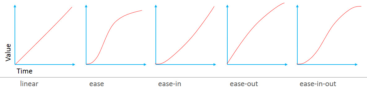
But as the picture above shows, there are other types of animation movements and CSS provided a property named animation-timing-function by which we can set these values for an animation and create a different type of movement.
CSS animation-timing-function Property Syntax
animation-timing-function: linear|ease|ease-in|ease-out|ease-in-out|step-start|step-end|steps(int,start|end)|cubic-bezier(n,n,n,n)|initial|inherit;CSS animation-timing-function Property Value
Here’s the list of values we could use for this property:
| Name | Description |
|---|---|
| linear | The movement of the animation is even |
| ease | The speed of animation increase until it reaches the middle of the animation then slows down towards the end. (this is the default value) |
| ease-in | The speed of animation is slow at the beginning but increases as it progress. |
| ease-out | The speed of animation is fast at the beginning but slows down as it progress. |
| ease-in-out | The speed of animation is slow at the beginning, and then speeds up until it reaches the middle of the animation, and then slows down again towards the end. |
Example: animation-timing-function property in CSS
<!DOCTYPE html>
<html>
<head>
<title>CSS is fun :)</title>
<meta name="viewport" content="width=device-width, initial-scale=1.0">
<style type="text/css">
*{
margin:unset;
box-sizing: border-box;
}
div{
margin: 2em;
}
li{
animation-name:padding;
animation-delay: 2s;
animation-duration:2s;
animation-fill-mode: forwards;
display: inline-block;
border:thin solid lightgray;
border-radius: 1em;
margin-left: 0.2em;
padding:0.2em;
}
@keyframes padding{
from{
padding-bottom:0.2em;
}to{
padding-bottom:15em;
}
}
li:nth-child(1){
animation-timing-function: linear;
}
li:nth-child(2){
animation-timing-function: ease;
}
li:nth-child(3){
animation-timing-function: ease-in;
}
li:nth-child(4){
animation-timing-function: ease-out;
}
li:nth-child(5){
animation-timing-function: ease-in-out;
}
</style>
</head>
<body>
<ul>
<li>the linear animation</li>
<li>the ease animation</li>
<li>the ease-in animation</li>
<li>the ease-out animation</li>
<li>the ease-in-out animation</li>
</ul>
</body>
</html>
CSS cubic-bezier() Function:
There’s a CSS function called cubic-bezier() that can also be used for the value of this property.
Using this function, we can create our own type of speed for an animation.
This function takes 4 values each ranged from 0 to 1. But setting those values is little confusing and it’s best to use tools that are already available.
Two of them are Chrome’s Styles pane and Firefox’s Rules pane.
Example: cubic-bezier() function in CSS
<!DOCTYPE html>
<html>
<head>
<title>CSS is fun :)</title>
<meta name="viewport" content="width=device-width, initial-scale=1.0">
<style type="text/css">
*{
margin:unset;
box-sizing: border-box;
}
div{
margin: 2em;
}
li{
animation-name:padding;
animation-delay: 2s;
animation-duration:2s;
animation-fill-mode: forwards;
display: inline-block;
border:thin solid lightgray;
border-radius: 1em;
margin-left: 0.2em;
padding:0.2em;
}
@keyframes padding{
from{
padding-bottom:0.2em;
}to{
padding-bottom:15em;
}
}
li:nth-child(1){
animation-timing-function: cubic-bezier(0.3,0.4,0.3,1);
}
</style>
</head>
<body>
<ul>
<li>the linear animation</li>
</ul>
</body>
</html>
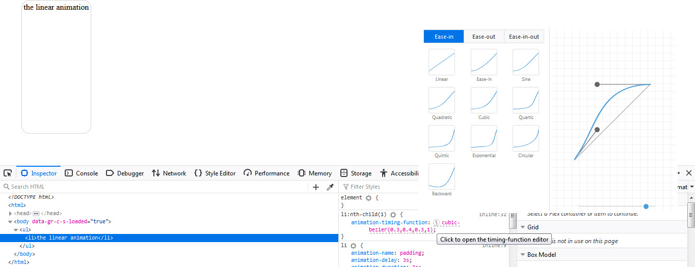
In the example above we’ve set four values in cubic-bezier() function but those might not be what we want.
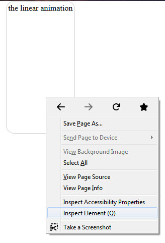
If this example is running in Firefox bowser, we can right click on the <li> element of the page and select Inspect-Element (just like the way picture below shows):

Then in the opened window, we can select the icon declared in the picture below and start to visually modifying the values set in cubic-bezier() function.

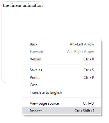
Also, if the example above is running in the Chrome browser, we can right click on the <li> element and select “inspect” (just like the picture below).

Then in the opened window, we can select the icon declared in the picture below and start to visually modifying the values set in cubic-bezier() function.

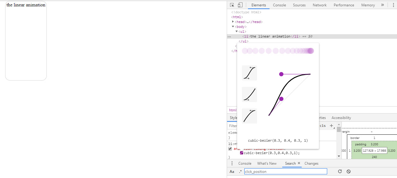
Other browsers like Safari and Opera have the same editor that you can find and use them in order to set the value for cubic-bezier() function.
CSS steps() Function:
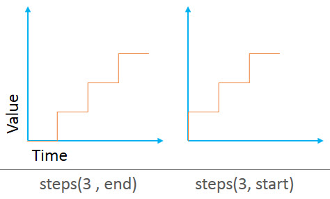
Other than values mentioned so far, the animation-timing-function property also takes another function as its value that is called steps( ).

CSS steps() Function Parameters:
This function takes 2 arguments (or parameters):
-
number: which is the number of steps that an
animation should be completed with. -
keyword: the value for this part is either
“start” or “end” indicating whether each change should take place at the
start or end of each step.
Example: using steps() function in CSS
<!DOCTYPE html>
<html>
<head>
<title>CSS is fun :)</title>
<meta name="viewport" content="width=device-width, initial-scale=1.0">
<style type="text/css">
*{
margin:unset;
box-sizing: border-box;
}
div{
margin: 2em;
}
li{
animation-name:padding;
animation-delay: 2s;
animation-duration:2s;
animation-fill-mode: forwards;
display: inline-block;
border:thin solid lightgray;
border-radius: 1em;
margin-left: 0.2em;
padding:0.2em;
}
@keyframes padding{
from{
padding-bottom:0.2em;
}to{
padding-bottom:15em;
}
}
li:nth-child(1){
animation-timing-function: steps(3, start);
}
li:nth-child(2){
animation-timing-function: steps(3, end);
}
</style>
</head>
<body>
<ul>
<li>the linear animation</li>
<li>the linear animation</li>
</ul>
</body>
</html>
If you run this example you’ll see that instead of fluidly moving along, the animation is divided into three steps (because of the value 3 that we set for steps() function).
We can also use two values named “step-start” which is equal to “steps(1, start)” and “step-end” which is equal to “steps(1, end)”.
Example: CSS steps() function in animation
<!DOCTYPE html>
<html>
<head>
<title>CSS is fun :)</title>
<meta name="viewport" content="width=device-width, initial-scale=1.0">
<style type="text/css">
*{
margin:unset;
box-sizing: border-box;
}
div{
margin: 2em;
}
li{
animation-name:padding;
animation-delay: 2s;
animation-duration:2s;
animation-fill-mode: forwards;
display: inline-block;
border:thin solid lightgray;
border-radius: 1em;
margin-left: 0.2em;
padding:0.2em;
}
@keyframes padding{
from{
padding-bottom:0.2em;
}to{
padding-bottom:15em;
}
}
li:nth-child(1){
animation-timing-function: step-start;
}
li:nth-child(2){
animation-timing-function: step-end;
}
</style>
</head>
<body>
<ul>
<li>the linear animation</li>
<li>the linear animation</li>
</ul>
</body>
</html>